Designing a brand-new
Telecom operator

Typology
Industry
Telecommunications
Year
2021 — 2025
Services
Product Strategy, UX/UI Design
Background
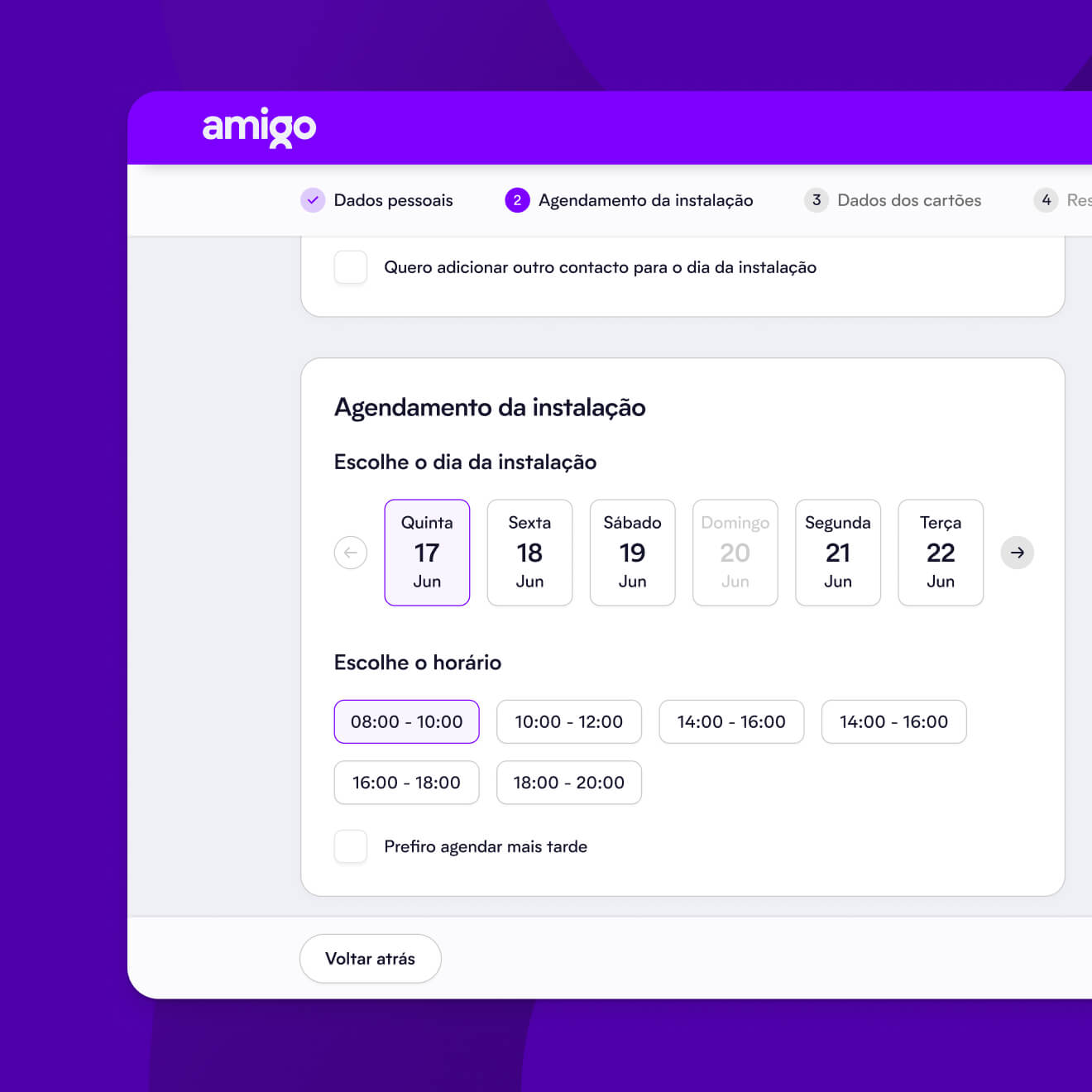
On the verge of entering the telecom market, amigo reached out to us with a clear mission: to help create and design a new product and user experience from the ground up, setting the stage for their market launch.
Challenge
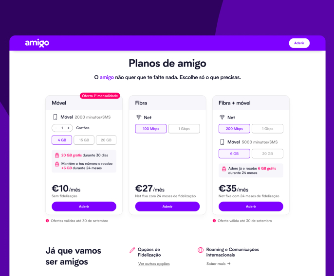
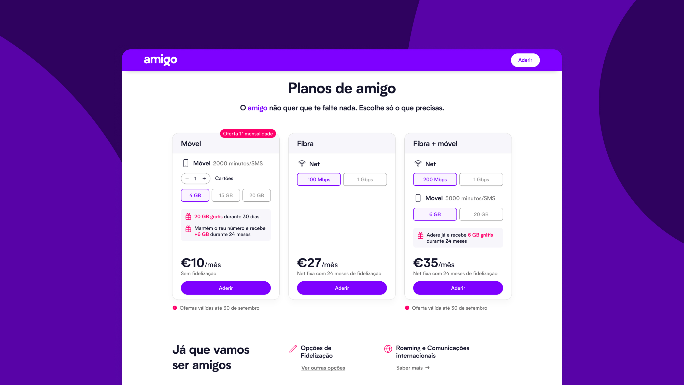
The main focus was guaranteeing that amigo provided an intuitive user experience, complemented by a clear interface, both on the Website and the Mobile App.
The collaboration with amigo was marked by cooperation and consistent communication. Our approach was dynamic, with a constantly updated roadmap that allowed alignment with amigo's vision and prompt adjustments to the changing market conditions.
Creating amigo's digital identity involved combining our UX and UI development with their branding efforts, particularly the brand’s tone, communication style, and structure.
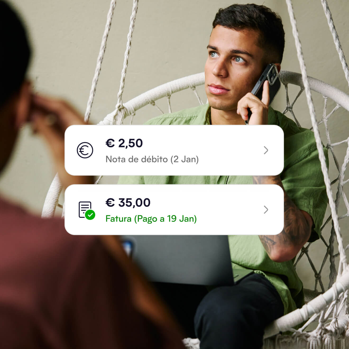
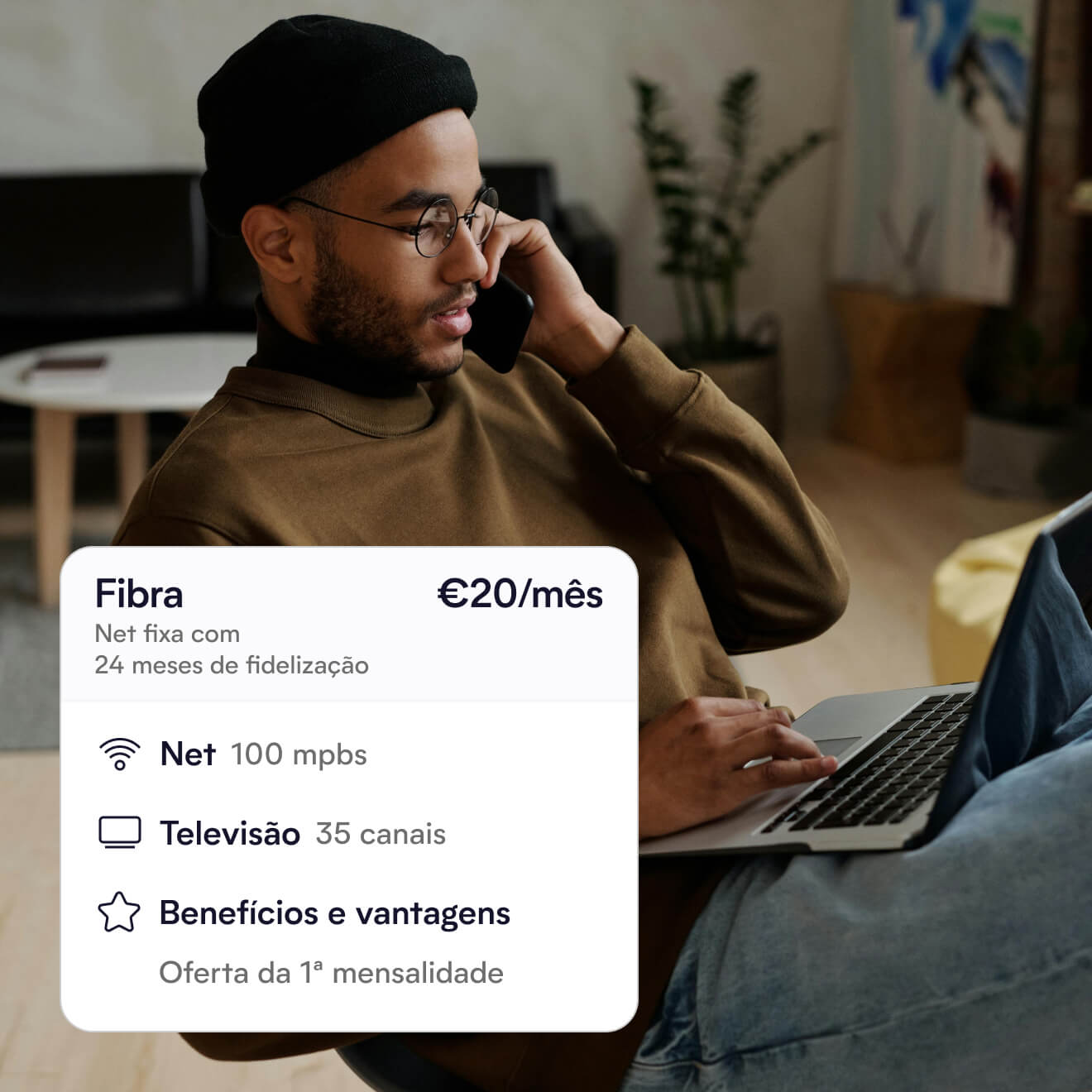
We designed intuitive user flows guided by competitor insights, simplifying navigation, reducing paperwork, and providing clear visibility into subscriptions, add-ons, and payments.
Shaping the Mobile experience
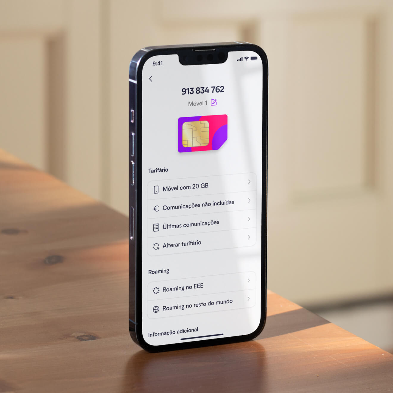
Designed with a sharp focus on user needs, the app has an intuitive interface for navigating through its features. From seamless plan adjustments and hassle-free billing to convenient mobile swaps and roaming options, it ensures every interaction is smooth, empowering customers with full autonomy over their service management.
Two distinct design systems were crafted: for the Website and the Mobile App. Both were designed with a focus on consistency, scalability, and robustness, ensuring they evolve seamlessly alongside amigo's growth while upholding the brand's integrity.
Having two separate Design Systems streamlined the development process, catering specifically to the needs of the Web and Mobile teams. This strategy minimized potential friction and misalignment and guaranteed a smoother Development handoff.
Bridging Design and Development
Close collaboration between our Design and amigo’s Development teams was crucial, with regular sprint reviews, daily meetings, and design collaboration tools ensuring alignment and efficient handoffs. Design QA sessions helped refine the product vision and maintain consistency.
Leonor Dias
Brand Manager — Vodafone
“Pixelmatters is a strong partner to structure, design and deliver your digital touchpoints and embrace the future in a confident way.”
Partner with us
We can help you build your product from the ground up just like we did with amigo.
Tiago Romano
Business Developer
Average response time
1 to 4 hours
The result
From the intuitive web interface to the Mobile App, these digital solutions have enabled amigo to offer a seamless and autonomous user journey, marking their debut as a strong player in the telecom sector.
NPS Score on overall user satisfaction on subscription flow.
Of users praised the simplicity of the subscription process.
NPS Score regarding the speed of the subscription process.
